What Should the Page Behind a Kitchen Remodeling Ad Show
An ad can earn a click in a second and lose the homeowner in the next five. For a kitchen remodeling company in Los Angeles, the page that opens after the click carries most of the weight, because a person about to spend months planning a major project reads that page the way they would read a stranger at the front door. The questions below come up whenever owners sit down to rebuild the landing pages behind their campaigns.
What is a landing page for a kitchen remodeler actually for?
It has one job: move a homeowner from curiosity to a booked design consult. It is not the home page, and it should not try to tell the whole history of the company. A visitor who arrived from a search about remodeling a galley kitchen wants to see galley kitchens. A visitor who arrived from a map listing wants to know the company is real and close by. The page works best when it answers the single question that the ad raised and then makes the next step obvious.
Many companies send every ad to the home page because it is easy. The home page tries to serve every visitor, so it serves none of them well. A separate page for each campaign theme, even a plain one, usually holds attention longer.
How much should the page show, and in what order?
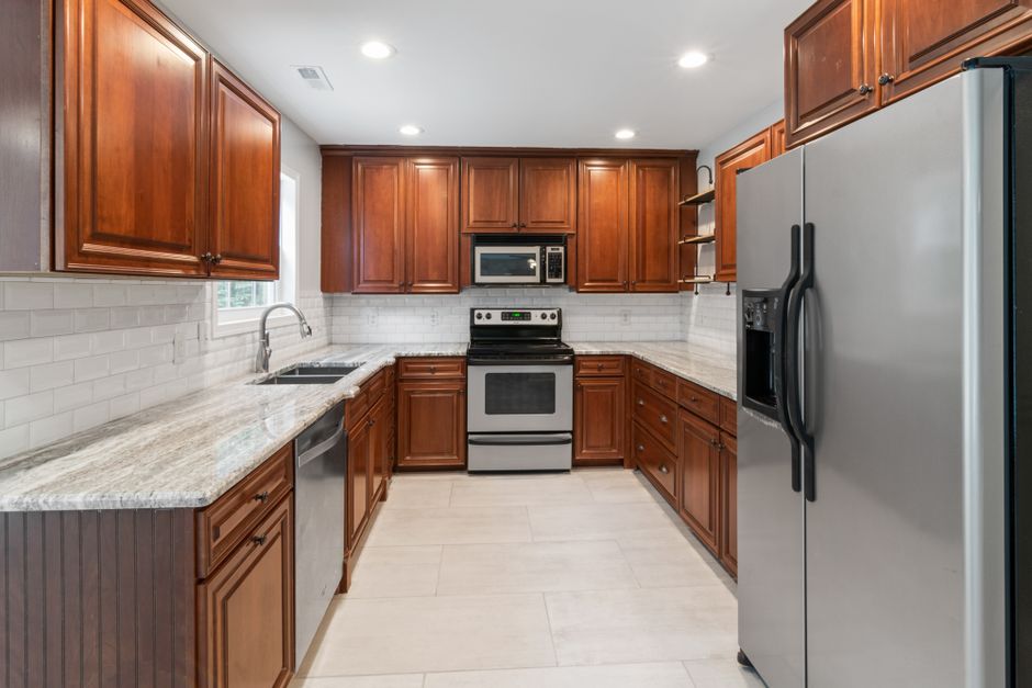
Start with a headline that repeats the promise in the ad, in plain words. Under it, put a large photograph of a finished kitchen that looks like the kind of house the visitor lives in. A bungalow owner in Silver Lake and a ranch house owner in the San Fernando Valley are not shopping for the same room, and the opening image tells them whether the company understands the difference.
After the photograph, give a short description of how a project moves from first visit to finished kitchen. Homeowners fear disruption more than almost anything else. A calm, specific explanation of the steps, such as measuring, drawing, plan review, ordering, demolition and installation, reduces that fear more than adjectives ever will.
Then show a handful of projects with a sentence on what was solved in each. Keep the list short. Three well described kitchens beat twenty unlabelled ones, because the visitor can actually read them.
Where do permits and plan review belong on the page?
Many kitchen projects involve electrical, plumbing or structural changes, and in the city those go through the Los Angeles Department of Building and Safety. Owners often have no idea this is coming. A short, honest paragraph that explains plan review exists, that it takes time, and that the company handles the paperwork tells the homeowner this is not a first attempt. It also filters out visitors who want a result in a few weeks and would have been disappointed later.
Do not bury this. Put it in the middle of the page, after the process steps, where a curious reader will find it while scanning.
Should the page promise a price or a discount?
The page should avoid quoting numbers it cannot stand behind. A kitchen is priced after measuring, choosing materials and understanding the house. A number on a landing page either scares off a good prospect or attracts a bad one. The offer that fits the work is time with a designer: open consult slots, a measure visit, a first layout sketch. These are real, they are limited, and they describe what the homeowner receives.
When the calendar is full, say so and name the next opening. Owners in Pasadena or Glendale who read an accurate message tend to wait for a slot rather than call a competitor, because the honesty counts as evidence of the company's workload.
How should the form or phone number work?
Give two ways to reach the company, a short form and a phone number, and make both visible without scrolling on a phone. Most visitors on the Westside and in Santa Monica will arrive on a mobile device, often in the evening, and a form with many fields is a reason to leave.
Ask only for what the first call needs: a name, a way to reach the person, the neighborhood, and a line about what they want to change. Everything else can wait for the consult. A field asking for a budget tends to produce either blank answers or guesses, and neither helps the designer.
After the form is sent, show a confirmation that says what happens next and roughly when. A vague thank you leaves the homeowner wondering whether anything arrived.
What proof helps most?
Real photographs, a clear statement of the license the company holds, and a short description of how long it has worked in the area help the most. Quoted praise is easy to fake and easy to distrust, so pages tend to work better when the work itself is the evidence. A before and after pair with a caption describing the layout change gives a visitor something concrete to judge.
Names of crews and designers, with a simple photograph, add warmth. A homeowner is about to let these people into the house for weeks. Seeing faces turns an abstract company into a group of individuals.
How fast should the page load?
Quickly enough that a visitor on a phone in the middle of Los Angeles County traffic does not give up. Large photographs are the usual cause of slow pages. Resize them to the width they are displayed at, and let those below the first screen load as the visitor scrolls. A page that appears at once, with the headline and the first image visible, feels more trustworthy than a heavier page that arrives in pieces.
Does one page need to match every neighborhood?
Not every neighborhood needs its own page, but the biggest service areas often justify it. A campaign aimed at Pasadena can mention the older homes and the mix of craftsman and mid century houses. One aimed at Glendale can speak to the hillside properties. The point is that the landing page sounds like it knows where the visitor lives. Only claim familiarity that the company has earned from actual projects in those places.
How do you know the page is working?
Look at how many visitors reach the form, but give more weight to how many of those become booked consults and then signed projects. A page that gets fewer form submissions but sends better prospects to the designers is doing a better job. Ask each caller which page they saw, and keep a simple record next to the consult notes.
Change one thing at a time. Swap the headline, wait for a full cycle of consults, and compare. Changing the photograph, the headline and the form together makes it impossible to say what moved the result.
What mistakes are most common?
- Sending all campaigns to the same page, whatever the ad promised.
- Opening with the company history instead of the visitor's problem.
- Using stock photography of kitchens that look nothing like local homes.
- Hiding the phone number on mobile.
- Asking for too much information before a first conversation.
- Leaving an old offer on the page after the calendar has changed.
Fixing any one of these usually improves results faster than changing the ad itself.
Where should a remodeler begin?
Pick the single campaign that brings the most clicks, write down what its ad promises, and check whether the page behind it repeats that promise in its first line and first image. If it does not, fix that before touching anything else.